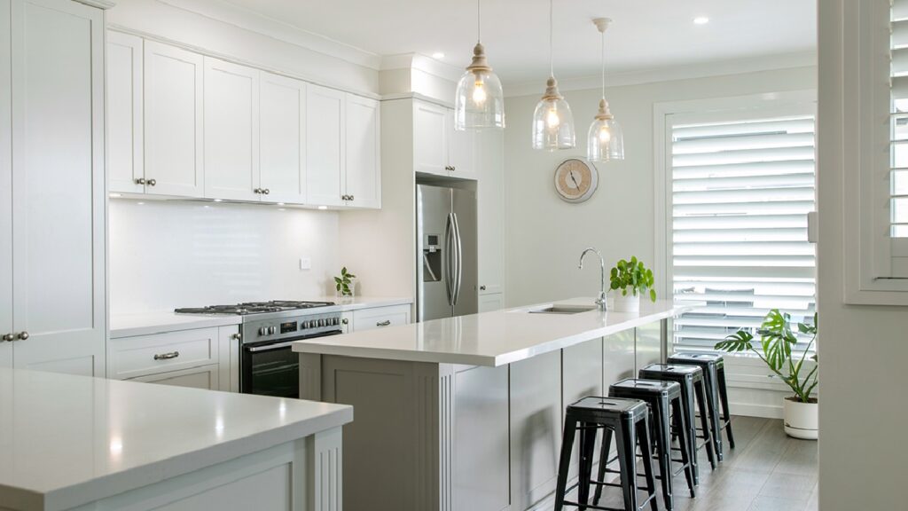
StyleThe contemporary kitchen colour schemes that never date are built from a restrained base of warm whites, earthy neutrals or deep anchor tones, layered with natural materials like timber, stone and brushed metal rather than trend-driven feature colours.
Choosing a kitchen colour is one of the few renovation decisions you live with every single day, and it is the one homeowners second-guess most. The good news is that timeless palettes follow predictable rules. In this guide, we break down six contemporary kitchen colour schemes we see holding their appeal year after year in homes from Avoca Beach to Newcastle, so you can settle on a direction with confidence before you book a design consultation.
What makes a contemporary kitchen colour scheme timeless?
A timeless contemporary kitchen colour scheme balances one dominant neutral, one supporting tone and one natural material, and lets proportion do the rest. Kitchens that date quickly usually break this rule by leading with a fashion colour across every surface, then pairing it with hardware and benchtops chosen to match the trend rather than the home.
Three principles separate the palettes that last from the ones that need repainting in five years:
- The 60-30-10 split. Roughly 60% of visual weight in the base tone (cabinetry), 30% in the secondary tone (island, benchtop or splashback) and 10% in accents (tapware, handles, lighting).
- Undertone matching. Warm whites with warm timbers, cool greys with cool stone. Mixing undertones is the most common reason a finished kitchen feels slightly off.
- Colour in replaceable layers. Bolder personality belongs in stools, pendants, artwork and small appliances, which cost hundreds to change, not in cabinetry, which costs thousands.
Dulux’s annual Colour Forecast consistently positions warm neutrals and nature-derived tones as enduring foundations, which mirrors what we specify in our own contemporary kitchen designs. The six schemes below all follow these rules in different directions.
Why does warm white with natural timber never date?
Warm white cabinetry paired with natural timber is the most reliable contemporary kitchen colour scheme in Australian homes because it reflects light without feeling clinical. Stark, blue-based whites can read cold under the bright coastal light common across the Central Coast, while a warm white such as Dulux Natural White softens the space and flatters timber flooring.
The timber element does the personality work. Oak veneer open shelving, a timber-look island panel or a single bank of woodgrain overheads adds warmth and texture that paint alone cannot deliver. This pairing suits open-plan family homes in suburbs like Erina and Berkeley Vale, where the kitchen flows directly into living zones and the palette needs to harmonise with furniture rather than compete with it.
Works best with: brushed nickel or matte black hardware, stone benchtops with subtle veining, linen or rattan textures.
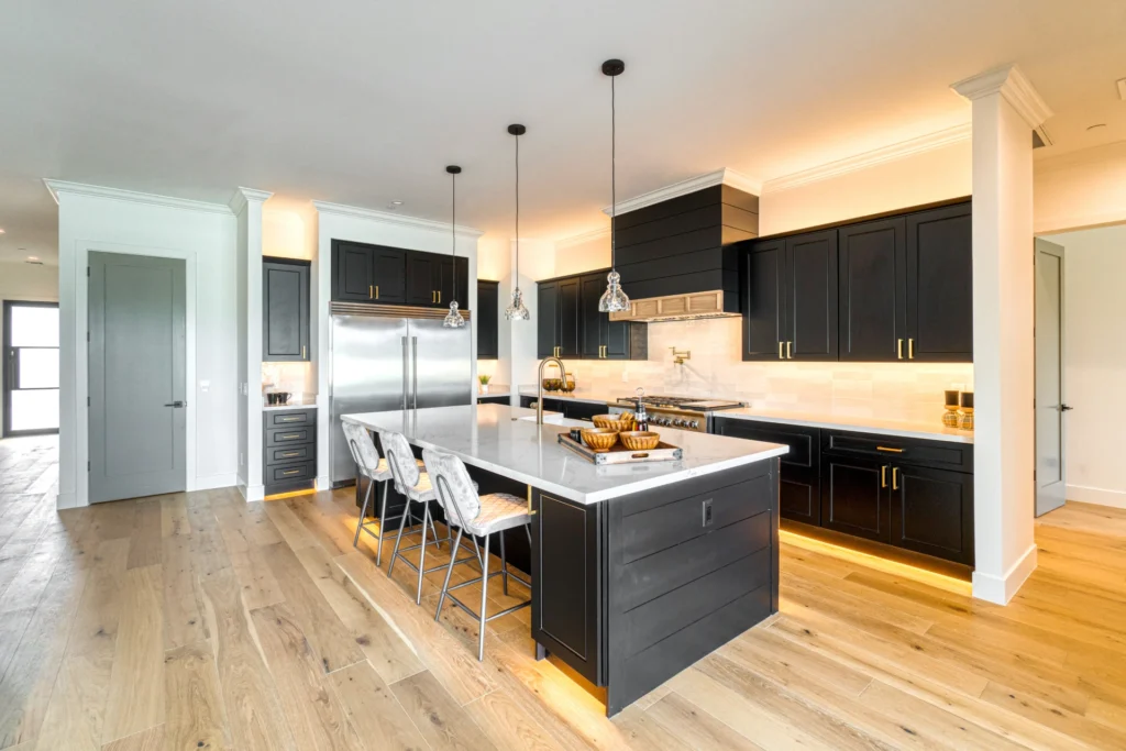
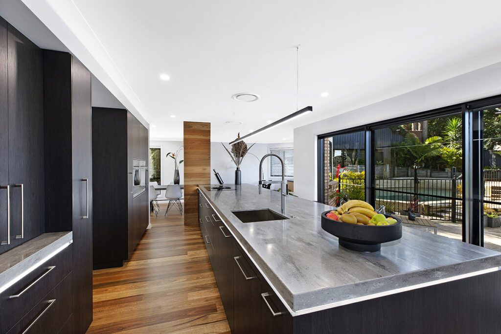
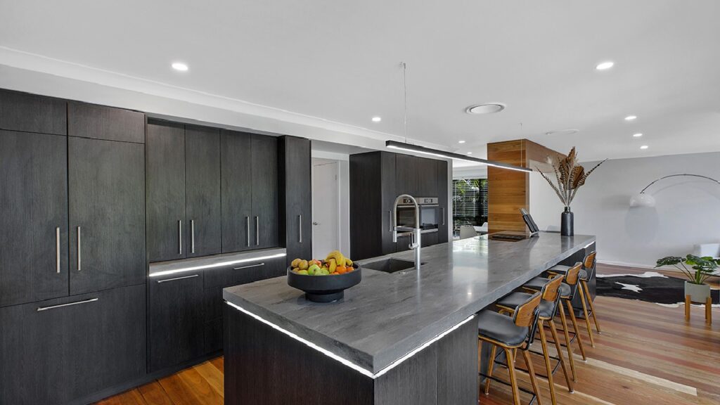
Is a two-tone charcoal and white kitchen still a safe choice?
Two-tone charcoal and soft white remains one of the safest contemporary kitchen colour schemes because it builds contrast into the architecture rather than relying on colour fashion. The standard formula places charcoal or graphite on base cabinets and the island, with soft white overheads keeping the upper half of the room light and the ceiling visually high.
This scheme earns its keep in larger kitchens with generous natural light. In a compact space, full-height charcoal can shrink the room, so we often limit the dark tone to the island alone. Charcoal also hides everyday wear better than white at bench level, a practical advantage in busy households around Tuggerah and Wyong where the kitchen takes a daily beating.
Works best with: stainless or brushed gunmetal tapware, concrete-look or white engineered stone, timber stools to break up the monochrome.
How do you use sage green without it dating?
Sage green stays timeless when it is treated as a neutral rather than a feature colour. Unlike emerald or teal, sage is a desaturated, grey-based green that behaves like a soft grey in changing light, which is why it has outlasted bolder green trends. The key is pairing it with natural stone and warm metallics so the scheme reads organic, not themed.
Specify sage on the island or base run, keep overheads in warm white, and ground the palette with a stone benchtop carrying beige or taupe movement. Brushed brass handles lift the green without tipping it into a statement. This scheme is a natural bridge for homeowners torn between a contemporary look and the relaxed feel of a coastal kitchen palette, and it photographs beautifully against greenery through windows, which most Central Coast blocks have in abundance.
Works best with: brushed brass or aged bronze hardware, travertine-look or warm stone surfaces, off-white walls.
Why is a navy island with a white perimeter so enduring?
A navy island against a white perimeter endures because navy functions as a near-neutral with more character than black. The deep blue anchors the room’s centrepiece while the white perimeter keeps the overall scheme light, so the kitchen never feels heavy even in modest floor plans.
Navy also takes hardware exceptionally well. Brushed brass reads classic, matte black reads sharper and more architectural, and polished chrome keeps things crisp. Because the colour is confined to the island, the commitment is lower than a full navy kitchen: if tastes shift in fifteen years, refinishing one cabinet run is a far smaller job than redoing the whole room. We see this scheme requested often in family homes around Gosford and West Gosford where the island doubles as homework bench, breakfast bar and entertaining hub.
Works best with: brushed brass or matte black handles, white stone with grey veining, pendant lighting in glass or aged metal.
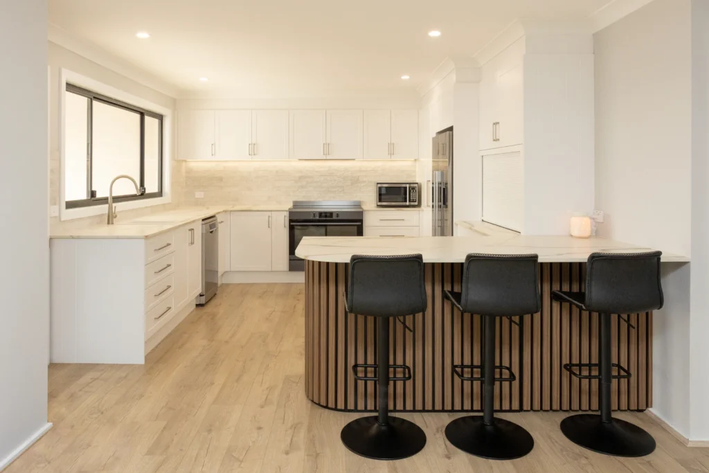
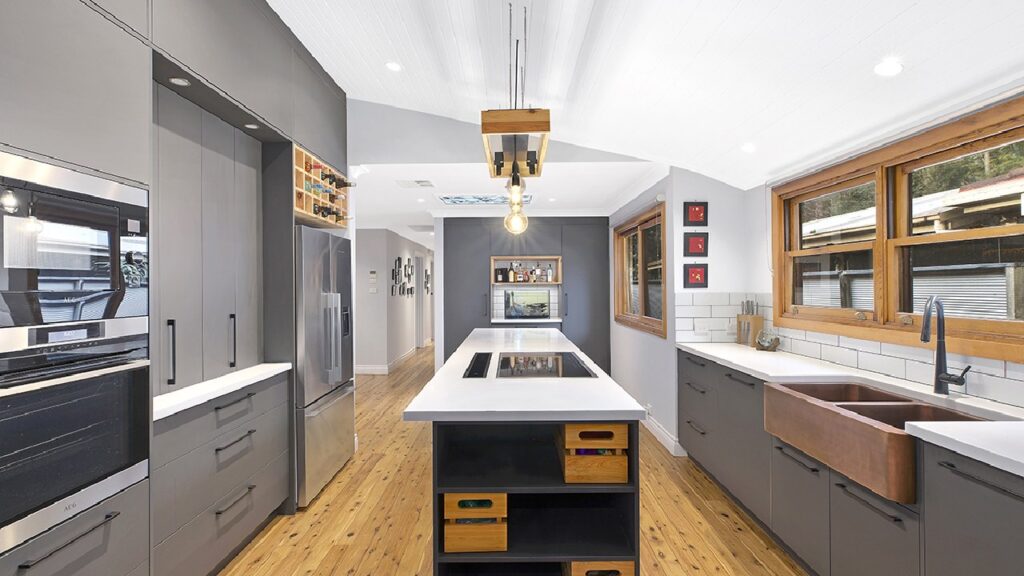
What makes earthy neutrals with matte black accents feel contemporary?
Earthy neutrals such as clay, taupe and warm beige feel contemporary because they replace the grey-on-grey palettes of the 2010s with tones drawn from the Australian landscape. Matte black accents in tapware, handles and lighting frames give the soft palette definition, the same way a dark window frame sharpens a neutral facade.
This is the scheme we recommend most often to homeowners building new in growth corridors, where we design kitchens across the Central Coast and into Newcastle, because it pairs effortlessly with the render, brick and timber tones of current home exteriors. The result is a kitchen that feels current today and quietly recedes as furniture and styling evolve around it.
Works best with: matte black tapware, woodgrain or fluted panel features, warm-toned engineered stone.
Can a greige tonal kitchen carry a whole room?
A layered greige scheme can carry an entire kitchen when texture varies between surfaces. Greige, the warm midpoint between grey and beige, works tonally: cabinetry one shade, benchtop a lighter shade with veining, splashback a textural finish such as zellige-look tile or fluted glass in the same family.
Because nothing contrasts sharply, the materials must do the talking. A honed stone benchtop, a two-pack satin cabinet finish and a handmade-look tile each catch light differently, which gives a one-colour room surprising depth. This scheme suits homeowners who want their kitchen to feel calm and high-end rather than bold, and it is the most forgiving base if you like restyling your home frequently, since virtually every accent colour sits comfortably against greige.
Works best with: integrated handles or slimline pulls, honed or matte stone, warm LED strip lighting under overheads.
How do the six schemes compare at a glance?
Each of the six contemporary kitchen colour schemes suits a different home, light level and lifestyle. The table below summarises where each performs best.
| Colour scheme | Best suited to | Light requirement | Risk of dating | Signature pairing |
| Warm white + timber | Open-plan family homes | Low to high | Very low | Oak veneer + stone |
| Charcoal + white two-tone | Larger, well-lit kitchens | Medium to high | Low | Gunmetal tapware |
| Sage green + stone | Garden-facing kitchens | Medium | Low | Brushed brass |
| Navy island + white | Island-centred layouts | Medium | Low | Brass or matte black |
| Earthy neutrals + black | New builds, landscape palettes | Low to high | Very low | Matte black tapware |
| Greige tonal layering | Calm, minimalist interiors | Medium to high | Very low | Honed stone + texture |
If you would rather test these palettes against real cabinetry and stone samples than swatches on a screen, our Erina showroom at 3/330 Central Coast Hwy displays full-scale displays you can stand in, open and compare side by side.
How do you choose the right scheme for your home?
The right contemporary kitchen colour scheme is the one that matches your home’s light, flooring and the rooms the kitchen connects to, not the one trending on a feed. Work through these four checks before locking anything in:
- Audit your light. South-facing kitchens receive cooler light and favour warm whites, greige and earthy neutrals. North-facing rooms handle charcoal and navy comfortably.
- Start from your floor. Existing timber, tile or polished concrete has an undertone. Every cabinet and benchtop decision should agree with it.
- Sample at full scale. A 10cm swatch lies. View door samples in your own kitchen at morning, midday and evening before committing.
- Put trend colours in the 10%. If you love a bold tone, give it to stools, pendants or splashback tiles you can swap later.
This is also where custom design pays for itself. Our 2025 HIA finalist project in Saratoga shows how a considered palette, refined panel work and material harmony come together when the scheme is tailored to the home rather than pulled from a catalogue.
Next steps
A timeless kitchen palette is equal parts colour theory and craftsmanship, and getting both right is far easier with an experienced team beside you. Planit Kitchens is a two-time HIA Hunter Region Kitchen of the Year winner (2023 and 2025), designing and building custom kitchens across the Central Coast, Newcastle and the Northern Beaches.
- Explore our approach to tailored custom kitchens
- See finishes in person at our Central Coast kitchen showroom
- Ready to talk palettes? Get in touch with our team